By browsing our site you agree to our use of cookies; you will only see this message once. Find out more by reading our privacy policy.
Responsive Web Design (or RWD for short) is designing websites to work well on devices with different screen sizes, from smartphones to the largest desktop monitors.
The design and layout of the webpage changes depending on the width of the browser window — so you can see how this works on a computer by making your browser window larger and smaller.
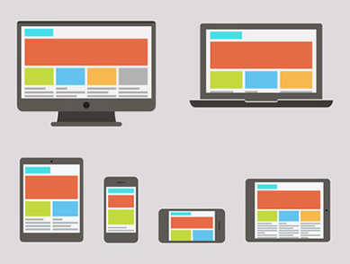
Responsive design is increasingly important as smartphones and tablets become more popular for internet browsing; people browsing non-responsive sites on those devices aren’t going to have a good experience. Since Google introduced their “mobilegeddon” update in April 2015 it’s even more vital. Now if your site isn’t mobile friendly it won’t show in search results for people on mobile devices; only desktop and laptop users will see your website when they Google.


")